Regardless of the media you’re using to communicate, avoid using visual characteristics such as spatial references or color to communicate information. When providing instructions, consider whether the instructions are likely to make sense to a person who is blind, or to the person who is accessing the content of a video by reading a transcript. Specific examples are provided below.
Avoid Using Spatial References
Spatial references such as “click the circle on the right” are meaningless to a screen reader user, who can access the web page content but isn’t likely to know its shape or its spatial position within the layout of the page. Instead, consider referring to the type and name of an object. For example, “the More Info button in the sidebar” is probably a more meaningful reference because it refers to the object’s name (“More Info”), its type (button), and its structural location (in the sidebar) as opposed to its spacial location.
Avoid Using Color to Communicate Information
Some users are unable to perceive color differences, or may not perceive color the same way you do. Therefore it is important to avoid using color alone to communicate information. For example, if link text within a paragraph of text is designed to be recognizable solely by its color (e.g., black text, blue links), the links should also be underlined. Otherwise, users who are unable to perceive color differences may be unable to distinguish links from surrounding text.
Another example is “required fields are in red.” It is okay to communicate “required” using red text, but in order to communicate this information to people who are unable to perceive color, there must be one or more additional ways of communicating the same idea. For example, required fields could include the word “required” as part of the label.
Another common example includes identifying different groups of data in a graph. If different groups are represented by different colors, they should also be distinguishable via other means. For example, in a bar chart, the bars could differ by color but could also have different fill patterns; or in a line chart, the lines could differ by color but could also be labeled with the name of the group.
Color Contrast in Documents
Text and icons, in order to be easy to read, must have sufficient contrast between foreground and background colors. The W3C Web Content Accessibility Guidelines (WCAG) defines specific contrast ratios that must be met for compliance.
Techniques for Word
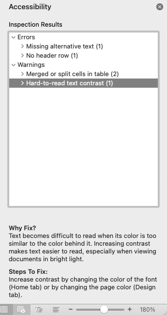
The “Check Accessibility” feature built into Microsoft Office will flag “Hard-to-read text contrast” if the ratio of the text and the background falls below a certain threshold. Follow the prompts within the Inspection Results to increase the contrast. For an overview of the “Check Accessibility” feature, see our Checking Microsoft Office for Accessibility page.
Technique for PDF
Adobe Acrobat’s built-in Accessibility Checker includes an option “Document has appropriate color contrast” that can be toggled on/off with a checkbox. However, this results only in a warning that color contrast must be reviewed manually. Given this limitation, it is important to review color contrast in the document’s authoring software before exporting or saving it as a PDF.
Colour Contrast Analysers
Below are several free tools have been developed that make it easy to check color combinations for WCAG compliance.
The WebAIM Color Contrast Checker is a website that evaluates a pair of colors for WCAG compliance. The user can enter the hex value for each color, or they can select a color using the color picker widget (specific functionality varies by browser). The checker then calculates the contrast ratio and rates the colors with a “Pass” or “Fail” rating.
Conveniently, the site also includes a slider that can be used to gradually lighten or darken either of the colors until a “Pass” rating is attained.
The WAVE Browser Extension, which is also developed by WebAIM, contains many of the same features as WebAIM's Color Contrast Checker while being used directly in your browser.
"The WAVE Chrome, Firefox, and Edge extensions allows you to evaluate web content for accessibility issues directly within your browser. Because the extension runs entirely within your web browser, no information is sent to the WAVE server. This ensures 100% private and secure accessibility reporting. The extension can check intranet, password-protected, dynamically generated, or sensitive web pages. Also, because the WAVE extension evaluates the rendered version of your page, locally displayed styles and dynamically-generated content from scripts or AJAX can be evaluated."
TPGI’s Colour Contrast Analyser is a downloadable application for both Windows and Mac that enables you to check the contrast of any two colors from your computer screen. This makes it particularly useful for checking colors in various applications, including documents or software, not just websites.
You can do so by entering the hex values of color combinations or by using the eyedropper tool to grab foreground and background colors from anywhere on the screen. The tool then provides information on the contrast between these colors, including Pass or Fail ratings for various levels of WCAG compliance. As noted above, our goal at the University of Missouri-St. Louis is to at least attain a Pass rating at Level AA, although a Pass rating at Level AAA is strongly encouraged.
The Deque Color Contrast Analyzer provides similar functionality to the WebAIM Contrast Checker, but in a slightly different interface and with a few additional features.
