Chapter 5: The User Interface
Making up metaphors
An approach for displaying results
Artificial Intelligence App Helps Blind People
Best Websites Balance Self-Expression and Functionality
Clever Circular Calendar
A Computer Interface That Takes a Load Off Your Mind
The Economic History of the Last 2,000 Years in 1 Little Graph
Araha, Inc. Demo: The Visual Metadata Company
Digital Maps Tell the Time
As Easy As Breathing
For High-Tech Control, the Eyes (and Hands) Have It
Feeling Blue? This Robot Knows It
Giving Customers What They Want: Why Market Orientation is Still Vital to Customer Retention
Interface Gets the Point
Interview With the KDE and Gnome UI/Usability Developers
Lijun Yin and the Face of the Future
A new look at user interface
Microsoft Training Computers to Finish Our Sentences
Project Descry
The Sociology of Interfaces
The Touchy-Feely Side Of Telecoms: Ed Colgate
Touching Molecules With Your Bare Hands
Touch Technology: Internet May Let Us 'Feel' the Stars
Training Computers to See Metaphors
User Interfaces and Decision Making
User Interface Design -- Software Tools
User Interface Example
Why We Should Lose the Back Button
Will Machines Ever Understand Us?
The Interface Revolutionary
You There, at the Computer: Pay Attention
Visualize weather data
Tableau Picasso George Gorczynski visualizes Chicago's crime problem in this innovative and highly designed StoryPoints visualization. Chicago Crime Scene | Tableau Public
Introduction to Data Visualization
15 Stunning Data Visualizations (And What You Can Learn From Them)
Where We Came From, State by State
Beautiful Data is in the Eye of the Beholder
Adding BubbleMaps to your Dashboard Repertoire
The Art of Visualization
Cancer survival rates: tables, graphics, and PP
Comparison of Pivot Viewer to HTML
Ethical Standards for Infographics
Font for digits lets numbers punch their weight
Getting an Intuition for Big Data
Graphics and Web Design Based on Edward Tufte's Principles
The History of Philosophy Visualized
How Did we Build this Interactive Map
Oracle Health Sciences Institute and University of Maryland
Make Data More Human
Office of Creative Research
A Makeover for Maps
Periodic Table of Visualization Methods
The Information Sage
Florence Nightengale
- Nightingale's 'Coxcombs'
- Florence Nightingale’s statistical diagrams
- Florence Nightingale, datajournalist: information has always been beautiful
- Florence Nightingale: The passionate statistician
- Nightingale's 'Coxcombs'
- Florence Nightingale's statistical graphics
- Florence Nightingale Graphics
The Work of Edward R. Tufte
- Edward Tufte and Graphic Design
- Tufte Unshelved
- An Interview with Edward Tufte
- Slopegraphs
- Visual display of information - notes from Edward Tufte's lecture in Chicago, 8/16/00
- Summary of Edward Tufte's Visualization Course
- The Data Artist
The Challenger: An Information Disaster
The Joy of Statistics
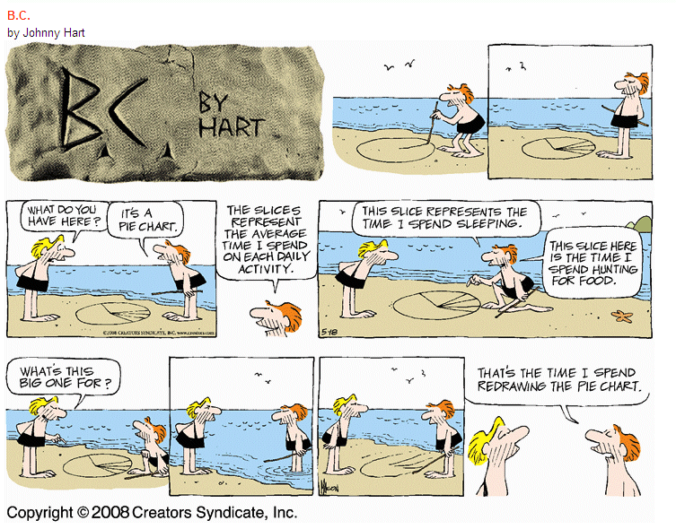
Move Over Pie Charts, Here Come FatFonts
SAS Visual Analytics
Top Considerations for Effective Visualizations

for a more complete version, see Figure 27
This map drawn by Charles Joseph Minard portrays the losses suffered
by Napoleon’s army in the Russian campaign of 1812. Beginning at the
left on the Polish-Russian border near the Niemen, the thick band shows
the size of the army (422,000 men) as it invaded Russia. The width of
the band indicates the size of the army at each position. In September,
the army reached Moscow with 100,000 men. The path of Napoleon’s retreat
from Moscow in the bitterly cold winter is depicted by the dark lower
band, which is tied to temperature and time scales. The remains of the
Grande Armée struggled out of Russia with 10,000 men. Minard’s graphic
tells a rich, coherent story with its multivariate data, far more
enlightening than just a single number bouncing along over time. Six
variables are plotted: the size of the army, its location on a
two-dimensional surface, direction of the army’s movement, and
temperature on various dates during the retreat from Moscow. It may well
be the best statistical graphic ever drawn.
A very bad visualization
 Processing: Data Visualization and More
Visualizing European Debt
Visualizing Information for Advocacy
Business Information Visualization
2012 VMI Top Visualization Optimization Trends
2012 VMI's 2012 CES Show Top Picks and Highlights
Twenty Best Visualization Tools
Human-Computer Interaction Guides
Computers to Read Your Body Language?
Cyber Shop Assistants at Your Service
EmotionML: Will computers tap into your feelings?
The Failure of Customization: Or Why People Don’t Buy Jeans Online
Graph Examples
Human-Computer Interaction Bibliography
Human Interaction Technology Lab
HCI Bibliography : Human-Computer Interaction Resources
Intelligent User Interfaces
In Search of a Customizable and Uniform User Interface
Smart Listeners and Smooth Talkers
Speech Recognition Systems Must Get Smarter
Visualization Trends For The Noosphere
Building Your Own Custom Dashboard vs. Using a 3rd Party Tool
Cockpit Entreprise 3D Video
Dashboard for Executive example
Dashboard for ProClarity example
Dashboard for LogiXML example
Dashboards at Unyson Logistics
Dashboards: The New Look of BI
Dashboard for Intelex Technologies example
Dashboards by Example
Dashboard Spy
Election Dashboard
Tableau Visualizations
eSiMon Dashboard Simulation Tool
Giving the Boss the Big Picture
Inappropriate Things to do in Charts
What's on Your Dashboard?
How to Score Points with a Dashboard
Mood of the Market
The Beauty of Data Visualization
Business Intelligence in A Mobile World
Design Issues
Haptics as a user interface
‘Imaginary' Interface Could Replace Real Thing
Inappropriate Things to do in Charts
Mapped pictures: image annotation
Mobile Business Intelligence is Here to Stay
The Promise of Flexible Displays
Pranav Mistry: The thrilling potential of SixthSense technology
Teaching Speech
Typeface Selection
Redesigning the Web for Touch Screens
Problems of Complexity of Design
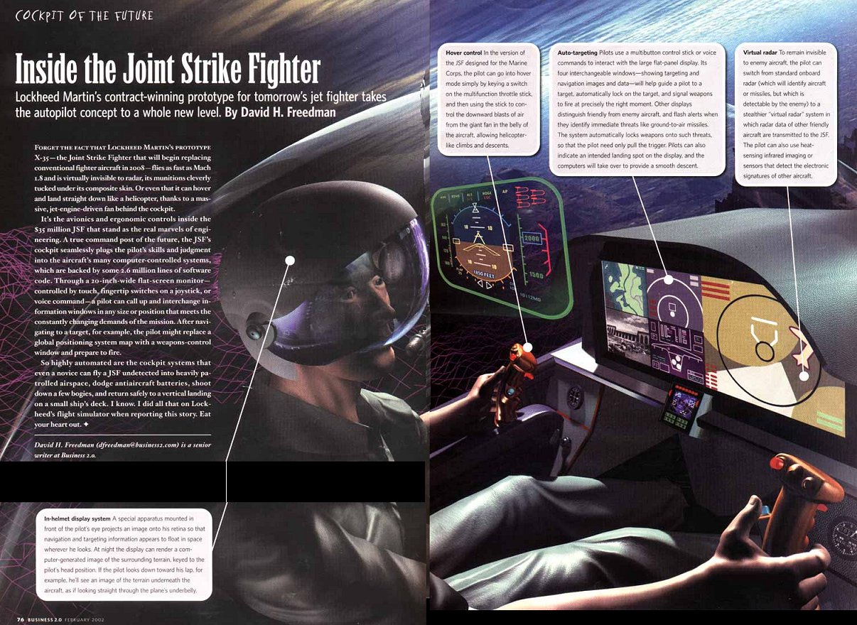
Inside the Joint Strike Fighter
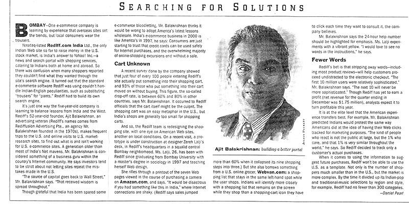
Searching for Solutions
Human-Centric Computing
The Interface Revolutionary
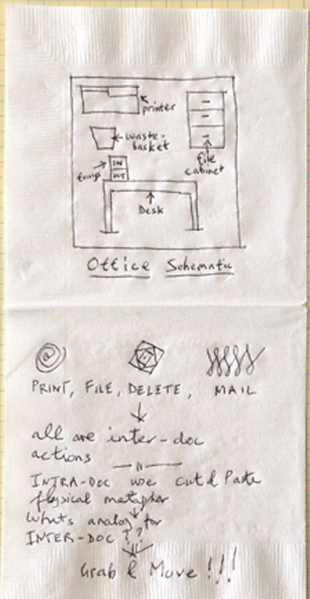
The Desktop (Office) Metaphor: Tim Mott's reconstruction of his sketch on a bar napkin (from Designing Interactions.
Project Athena
Data will not help you if you can't see it when you need it
Disney Researchers Add Sense of Touch to Augmented Reality Applications
Foldable display shows no crease after 100,000 folding cycles
Multi-Purpose Enabling Technology Lab
New Interface Technology Realizes 'Touchable' 3-D Images
PenWriter
Research to Improve Speech Recognition Software
Sex and Metaheuristic Metaphors
A Smart Phone That Knows You're Angry
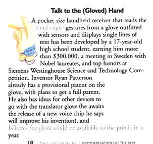
Talk to the (Gloved) Hand
Touché: Enhancing Touch Interaction on Humans, Screens, Liquids, and Everyday Objects
Using pictures 'a better way to search'
Why Siri is Still the Future
Virtual Reality you can Touch
General Information About User-Interfaces
The HCI Bibliography
User Acquainted Systems
|